Infogrid
At Infogrid, I worked on improving the Pipe Monitoring product for the Efficient Building Tribe. This tool helps building managers keep an eye on hot and cold water pipes to make sure everything stays compliant with regulations and safety standards. Here’s how I approached the project and the steps I went through to make it better.
- COMPANY Infogrid
- YEAR 2022
- ROLE SENIOR PRODUCT DESIGNER II
- LIVE PROJECT Visit Site

OVERVIEW
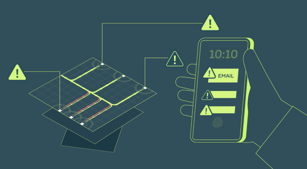
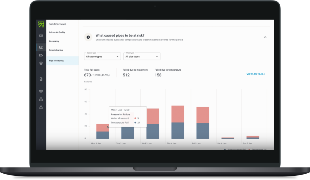
The main goal was to redesign the platform’s front-end so it could present real-time data about pipe temperatures and water movement in a way that was clear and easy to understand. Building managers needed actionable insights, so my focus was on making complex data simple to digest while improving usability across the board.
Baseline Testing
I started by testing the existing product with current users to get a sense of how it was performing. This helped me understand what was working, what wasn’t, and where users were struggling. It gave me a solid foundation to build on and showed me where improvements were most needed — things like how data was visualised, how easy it was to use, and how information was organised on the page.
Talking to Users
I spent time chatting with building managers who use the product day-to-day. I wanted to understand their workflows, challenges, and what they really needed from the platform. These conversations were so valuable—they helped me figure out what mattered most to them and shaped the direction of my designs.

Prototyping
Using everything I’d learned from testing and talking to users, I started sketching out ideas and creating prototypes. My focus was on three key areas:
• Data visualisation: Making graphs and charts easier to read and understand at a glance.
• Usability: Simplifying navigation and interactions so users could get things done faster.
• Information hierarchy: Organising content better so the most important stuff stood out straight away.
I started with rough wireframes to test ideas quickly, then moved onto polished prototypes that felt more like the finished product.
Iterating
Design is never a one-and-done process — it’s all about tweaking and improving as you go. I worked closely with data scientists and developers throughout, making sure my designs worked technically while still meeting user needs. I also ran usability tests with real users to see how they interacted with the prototypes and gathered feedback to refine things further.

Rolling Out Changes
Once everything was tested and ready, we rolled out the new designs into the platform. The updates made it easier for building managers to monitor pipes in real-time, spot trends in temperature data, and find compliance-related info without any hassle.
Results
• The new data visualisations made it much simpler for users to spot patterns and take action quickly.
• Improved usability meant building managers could complete tasks faster without getting stuck or frustrated.
• A clearer page layout helped prioritise key info so users didn’t have to hunt around for what they needed.