Vixa – From the AA
Vixa, serving over 13k members connecting them to their car health, notifying about upcoming services and realtime monitoring of faults. As the Lead product designer I led the design of Vixa web and app experience from 0 to 1 through initial research and discovery to delivery and UK National launch.
- COMPANY AA-X (THE AA)
- YEAR 2022-2024
- ROLE LEAD PRODUCT DESIGNER

Problem
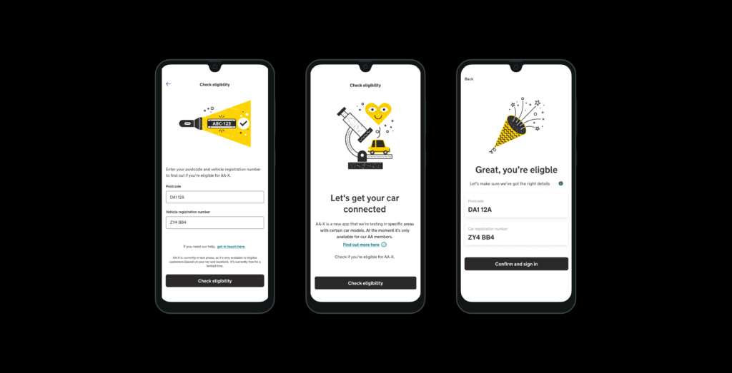
Vixa was preparing for national launch after a successful beta release to a closed AA member group. While Vixa was successful in beta, the on-boarding experience faced some challenges:
• On-boarding confusing - calls to support
• 76% Drop off (total across journey)
• Circa 25% conversion rate
• Poor understanding about compatibility
The proof of concept phase for on-boarding was underway when I joined the business. My first project was to execute on the delivery of design and then monitor and audit the live data and user journeys

Approach
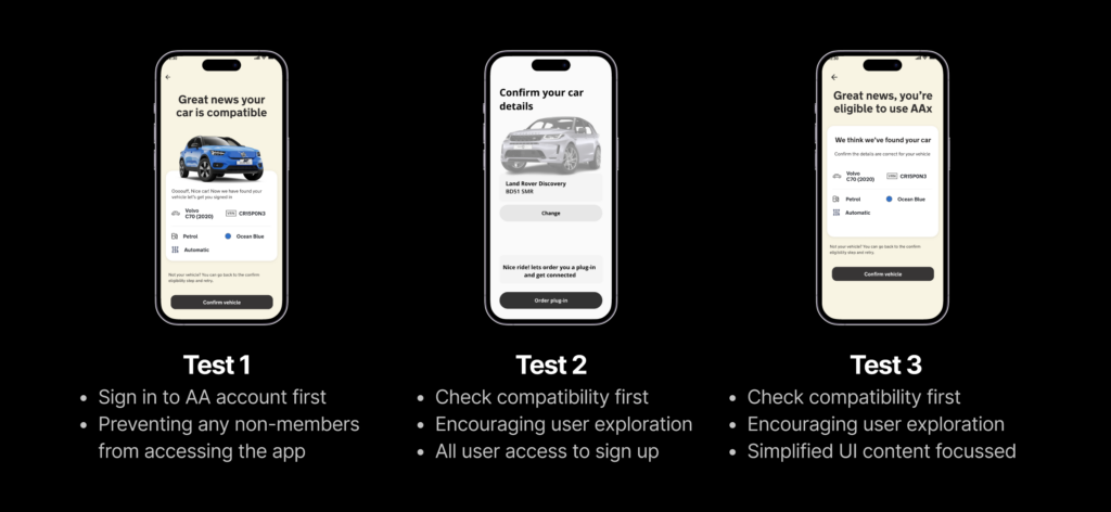
My design process was data driven. As well as conducting user interviews, I wanted to test multiple flows and screen concepts to drive conversion.
I wanted to base our approach on frequent iteration, using usertesting.com to quickly get feedback from our desired demographic, we could get feedback within hours of publishing our tests.
We prioritised testing with low fidelity Figma prototypes to understand the content and journey changes over understanding user behaviour at this stage.
I approached the design by:
• Reviewing the end-to-end on-boarding experience and map user behaviour to identify areas of focus
• Addressing the journey pain points I knew we could impact and improve
• Focussed on reworking the content to help user comprehension of the product

Solution
From the end of discovery to releasing the next iteration took around 4 weeks.
The final outcomes were:
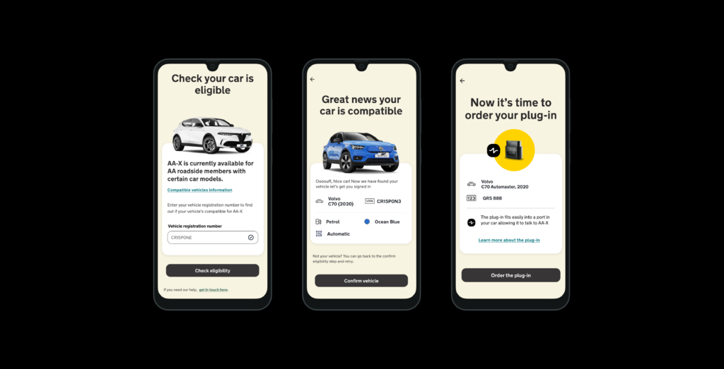
• Reimagined on-boarding and plug-in ordering journey
• Focussed tasks – shorter easier steps to encourage completion and momentum
• Addressing previous pain points by setting clear expectations and priming for next steps
The new journey provided users with clear explanation about their cars compatibility and eligibility to use the product. I identified key moments to present the benefits and how it works, giving contextual prompts for steps through out the journey. I also tried to remove barriers focussing on creating momentum through simple, single tasks per step.
I worked closely with content designers to craft a clear value proposition for the new flows.

Outcome
Vixa exceeded business targets within its first month post launch:
• 80% of new users completed the new on-boarding journey
• Increased comprehension across the journey attributed to new supporting content
These results validated my design-led, test-and-learn approach and established a new process for the team to follow for future work. It reinforced my views on the importance of continuous testing in on-boarding flows and design can influence value and instil user confidence in complex and technical product offering.

Learnings
Creating a protected space for creative exploration while managing leadership expectations is hard!
– I delivered weekly updates to the Chief Product Officer and Design experience lead throughout the project,
I also facilitated open discussion with the broader design team and managed relationships across product, marketing, and Engineering.
Always help users understand your product where ever they are in their journey.
– Understanding the 'Why' throughout the journey helped convert from tire kickers to users.
- Vixa From the aa
- Vixa From the aa
- Vixa From the aa
- Vixa From the AA
